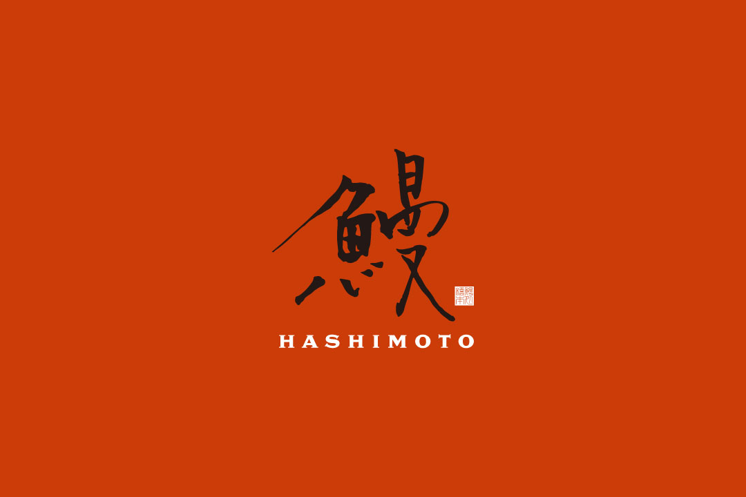
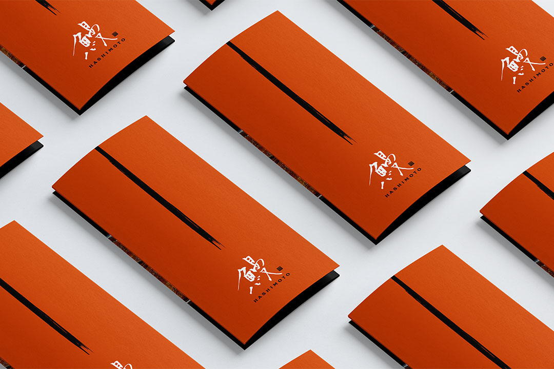
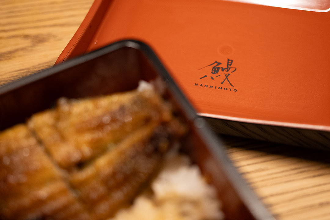
When designing logos for restaurants, I always prioritize making them look appetizing. For a logo for an eel restaurant, I hypothesized that the most appetizing design would prominently feature the word “Eel” written in large characters. With this in mind, I created the logo, ensuring the kanji characters were as easy to read as possible.